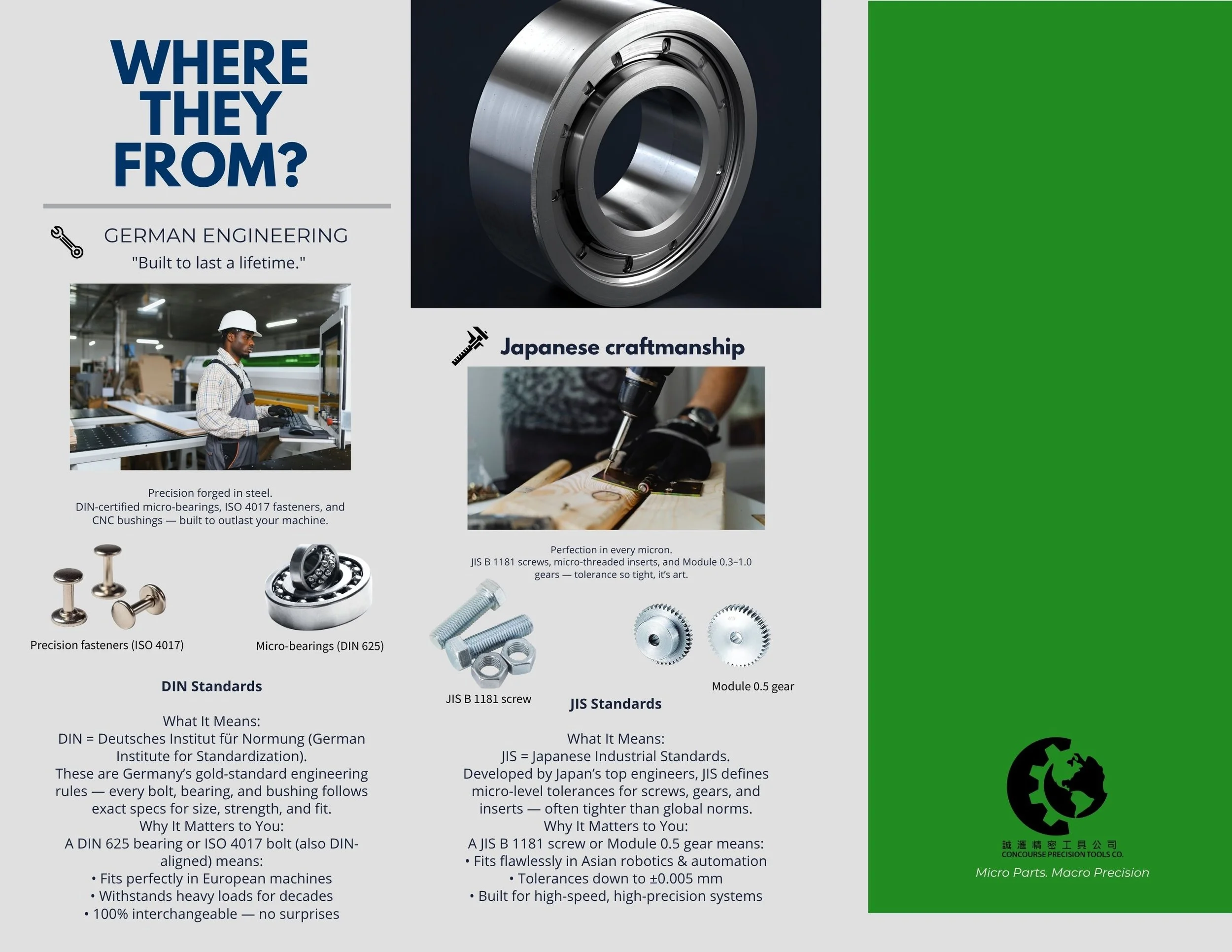
PAMPHLET – “Your Pocket Precision Guide”
A two-page promotional pamphlet created during my internship to showcase the company’s precision engineering, sourcing standards, and brand values


FAQs
Design Direction
The layout follows the new brand identity — using industrial blue, precision green, and neutral greys to create a professional and balanced tone.
Typography and Designs
Fonts Montserrat and Open Sans ensure clarity and consistency. Visual elements like gears, icons, and product photography highlight craftsmanship and reliability.
OutCome
A clean, informative, and cohesive pamphlet that communicates quality, precision, and trust, aligning with the company’s global brand image.

